22 Room Color Combination Ideas
When it comes to designing a room, color is the first handshake between your home and anyone who walks in.
It sets the mood, sparks emotions, and sometimes even makes or breaks how large or cozy a space feels.
Choosing the right color combinations isn’t just about aesthetics—it’s about psychology, balance, and creating a space where you genuinely enjoy spending time.
1. White and Navy Blue
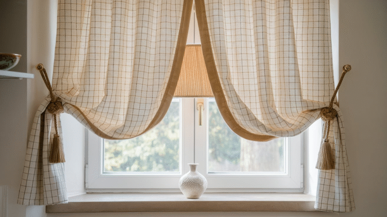
The classic coastal duo of crisp white walls paired with navy blue accents creates a fresh, sophisticated vibe.
Think white walls with navy blue curtains, rugs, or a statement sofa. This combo works especially well in bedrooms or living rooms, balancing calmness with boldness.
Pro tip: Use textured fabrics in navy (like velvet or linen) so the room feels layered, not stark.
2. Gray and Mustard Yellow
Gray acts as the calm, steady anchor, while mustard yellow adds a burst of sunshine without being overly loud. Studies show that yellow tones stimulate energy and creativity, making this combination perfect for home offices or dining areas.
Personal anecdote: I once painted my office gray but it felt flat—adding mustard throw pillows instantly turned the mood around.
3. Beige and Forest Green
This earthy pair whispers, “Bring the outdoors in.” Beige is the soft background, while deep forest green adds drama. Together, they evoke a calm, nature-inspired atmosphere.
According to environmental psychology, greens help reduce stress and enhance concentration—ideal for bedrooms and reading nooks.
4. Blush Pink and Charcoal
Blush pink isn’t just for kids’ rooms anymore. Pair it with charcoal gray and suddenly it’s chic, grown-up, and subtly romantic. Use blush for accent chairs or rugs, and charcoal for walls or cabinetry. This combination feels modern yet gentle on the eyes.
5. Black and Gold
This is the power couple of luxury design. Black offers depth and grounding, while gold introduces glamour. Use it carefully—black walls with golden hardware, picture frames, or lighting fixtures make a space look dramatic without feeling gaudy.
Statistic worth noting: In a survey by Zillow, homes with black front doors sold for up to $6,271 more than expected. Proof that black really adds value.
6. White and Sage Green
If serenity had a color palette, this would be it. Sage green is muted, soft, and versatile. When paired with white, it feels like a peaceful retreat. Perfect for bathrooms or kitchens.
Pro tip: Add natural wood elements like oak shelves to enhance the organic vibe.
7. Teal and Coral
This combo has a playful, tropical energy. Teal brings depth, while coral injects warmth. The two balance each other beautifully, especially in creative spaces like studios or kids’ rooms.
Personal anecdote: I once used this scheme for a small guest room—guests actually commented it felt like a cheerful Airbnb getaway.
8. Cream and Olive Green
Cream softens the richness of olive green, resulting in a sophisticated yet approachable look. Olive is timeless, often associated with heritage interiors, while cream keeps it from feeling heavy. This duo shines in dining rooms or living spaces with warm lighting.
9. Navy Blue and Burnt Orange
Navy is classic and dependable, while burnt orange adds vibrant energy without being overwhelming. Together, they create a bold but balanced palette. Great for accent walls with complementary furniture.
Pro tip: Keep accessories minimal—this pair already makes a statement.
10. Light Gray and Soft Lavender
Lavender’s subtle pastel hue paired with light gray creates a tranquil, airy vibe. It’s an underrated choice for bedrooms. According to color psychology, lavender reduces anxiety, making it excellent for relaxation spaces.
11. Brown and Cream
The most comforting color combination—like a hot cup of coffee with cream. Brown provides grounding warmth, while cream prevents it from becoming too dark. This combo works wonders in family rooms or libraries.
12. Aqua and White
Fresh, breezy, and perfect for bathrooms or sunrooms. Aqua instantly recalls the sea, while white keeps things crisp. This pairing is ideal for smaller spaces as it makes them feel larger and brighter.
13. Charcoal and Copper
Charcoal is moody and modern, and copper brings in a metallic warmth. This pairing is a designer favorite for kitchens and bathrooms. Fun fact: Metallic accents like copper or brass are trending, with a 31% rise in online searches for copper lighting in 2024.
14. Yellow and Gray-Blue
Yellow paired with a grayish blue creates a balanced energy—cheerful yet calm. This is a popular choice in Scandinavian-style interiors where muted tones dominate but pops of color bring life.
15. Terracotta and Cream
Terracotta brings rustic charm, while cream balances its richness. Together, they’re warm, welcoming, and timeless. Use this duo in living rooms with clay vases, textured rugs, and wooden accents.
Personal anecdote: My grandmother’s living room was terracotta and cream—it felt like stepping into a warm hug every time.
16. Black and White
The ultimate timeless duo. From modern minimalist apartments to traditional homes, black and white always works. Add geometric patterns or stripes for visual interest.
Statistic: In a Houzz survey, 78% of homeowners considered black and white the most versatile palette for resale value.
17. Mint Green and Peach
A refreshing, soft, and friendly combination. Mint green offers a cooling effect, while peach adds warmth. This playful mix is fantastic for nurseries or kitchens.
18. Slate Blue and White
Slate blue paired with white feels classic and tranquil. This works beautifully in bathrooms, bedrooms, and coastal-inspired living spaces.
Pro tip: Pair with rattan or light wood furniture for a balanced, breezy effect.
19. Deep Burgundy and Beige
Burgundy exudes richness and drama, but it can overwhelm. Beige softens it, creating a grounded yet bold effect. Perfect for dining rooms, libraries, or formal sitting areas.
20. Emerald Green and Gold
This combo screams luxury. Emerald green walls with gold accents (think hardware, light fixtures, or picture frames) look regal without going over the top. Best used in living rooms or entryways where you want to impress.
21. Sky Blue and White
Sky blue paired with white feels open, airy, and relaxing. This combination works well in bedrooms or sunrooms, evoking a sense of calm like lying under a clear summer sky.
Statistic: Studies show that blue is the world’s favorite color, chosen by nearly 40% of people across surveys. No wonder it’s such a safe bet.
22. Taupe and Soft Pink
Taupe’s neutrality paired with soft pink creates a sophisticated and cozy aesthetic. It’s subtle, warm, and great for bedrooms or small reading corners.
Conclusion On 22 Room Color Combination Ideas
At the end of the day, choosing a room color combination is more than just picking shades from a paint swatch—it’s about how those colors make you feel and how they shape the energy of your home. Some pairings, like black and white or beige and forest green, are timeless classics that never fail. Others, like teal and coral or mint and peach, bring playful freshness.
The trick is to think about function, mood, and personality. Want focus? Go with greens and neutrals. Want luxury? Black and gold never miss. Craving warmth? Terracotta and cream will wrap you up like a blanket.
Remember, paint isn’t permanent—it’s a playground. Don’t be afraid to experiment. The right color combination can turn a plain room into your favorite place to be.